Categories
Technology

Samsung Galaxy Note 4 – Unpacked Event

OK I’ll buy one.

Best to be clear about that from the start. After viewing today’s IFA Berlin presentation, I’m already planning to push substantial amounts of money onto the nice Korean people. So anything I say from here on cannot be regarded as truly neutral. Spectacles set to rose.

That being acknowledged, let me tell you why I want to spend excessive money on this excessive device.

The Galaxy Note has quite literally been my constant companion for the last three years. I bought the original one the day it went on sale in Ireland, used it in countless ways for both work and play. I’ve watched it grow year on year – the more refined Note II, the seriously powerful Note III – and with each new model, I have…

Stuck with the original. Though every iteration was more desirable than the last, it would not have been genuinely more useful. Not enough to justify starting another long and expensive contract anyway. The industry may love conspicuous consumers, but for most real customers a phone of this quality is a long-term investment.

And with the Note 4, the time may have come to begin again.

I don’t claim to be overwhelmed. Not a single one of the wilder rumours panned out. The Note 4 has a powerful 3GB of RAM, but not a revolutionary 4GB. Standard storage is still only 32GB instead of 64. Even the S4’s weatherproofing, considered almost a given by the rumour mill and greatly to be desired on such an expensive device, doesn’t seem to have materialised. On the other hand, we can be glad that some of the legends did not come to pass. Foldable AMOLED screens are an exciting technology with many possible applications, but would you really want to write on one? And though part of me would love to see the screen size creep up to 6” and beyond, it’s probably best to call a halt at 5.7”. A phone has to fit in pockets.

Rumours and wishful thinking aside, the Note 4 lives up to expectations. Specifications have been enhanced by respectable margins pretty much across the board, and there are a few highly significant improvements like high-speed charging and an ultra-low power mode that can keep it ticking over for a fortnight. Also the ghost of plasticky tackiness seems finally to be exorcised, with a slender metal rim and grippy leather-look back (now without the questionable faux stitching) lending it the air of a precision instrument like a classic SLR camera. At last the looks live up to its cost and quality.

If the Note 4 lacks anything it is one knock-down new feature to get excited about, but perhaps this is not surprising considering the nature of the beast. We’re long past the early days of the iPhone when each year’s model brought another feature that had obviously been missing. The Note already does about everything any other phone does, plus a lot of other things as well, all while pushing the form factor to its limits. Therefore Samsung tends to add its most experimental technology not to the flagship device itself, but to a special edition.

That bill is consummately filled this time by the Edge version with its cute auxiliary interface down one side. It’s an interesting and useful enhancement, but I’m not sure if this special-model strategy is paying off for Samsung. No doubt they worry that adding a controversial feature could raise costs while actually reducing the phone’s potential market, but I think if they’d been daring enough to put the edge display on the standard version it would have made the phone grab attention everywhere it was seen in use. Though it’s a cool extra, I can’t see myself paying extra for a version that has it. Indeed I’ll be a little surprised if any carrier even gives me the option.

The other way Samsung “adds” features of course is by offering new peripherals to integrate with. This time we see a bigger and better Gear watch, which I like but am neither rich nor ostentatious enough to buy. More excitingly, collaboration with Oculus brings a Gear VR headset – simply slot the Note 4 into a pair of goggles and you’re in another world. A technological tour de force by any standard and a sure headline-grabber, but not a reason for me to buy.

What does it for me is the solid improvements to the features I use regularly. More than once I’ve upgraded a phone basically to get a better camera, and with 16MP and real optical image stabilization, the Note 4’s is streets ahead of the original’s (already excellent) 8MP offering. And with a resolution breaking 500 pixels per inch and super AMOLED colour and contrast, its screen outclasses not just the fine precedent of the original, but every display available today.

Of most importance to me though are the enhancements to the Note’s core differentiation – the S Pen. This may mean little to anyone except artists, but there will now be interchangeable tips to adjust the pen-on-paper feel. Best of all the new pen will have 2048 levels of pressure sensitivity, the equal of professional graphics tablets. Do you really need that many levels to draw and annotate? No – but on the other hand you can never get too much sensitivity. The more nuance a pen is alive to, the more realistic the feel and the results.

I can’t see owners of the Note III rushing out to buy this, unless they are either blessed with excess wealth or cursed to own the most expensive phone available at any given moment. To them it would be only an incremental upgrade. For those of us who still have the Note or Note II however, decision time has come. And maybe it’s time for you too, if you haven’t yet sampled the delights of a device that, besides being everything a smartphone can be, is also a fine notebook and sketchpad.

The original Galaxy Note was a hard act to follow, so much so that it has taken three generations of enhancement to truly leave clear water. But a significantly better pen and camera make the Note 4 a significantly more useful tool.

Categories
Technology

What Will Be In The Ice Cream Sandwich?

image
It may lack a pen cursor, but the responsive line you can create demonstrates the Galaxy Note's potential as a drawing tool

I am eating an ice cream sandwich, thinking about Ice Cream Sandwich. This is either a complete coincidence, or my subconscious is taking the piss.

I refer of course to the next version of the Android operating system. Each one is named alphabetically after a dessert, because the people at Google maybe drink a little bit too much at lunchtime. So the main current version of Android is known as Gingerbread, the one they brought out specifically for tablets is called Honeycomb.

Ice Cream Sandwich is meant to reunify the line, to combine the features of both phone and tablet versions and scale well to screens of any size. So far it’s available on few devices except the Galaxy Nexus, but it’s promised soon for Samsung’s other large-screened Galaxy phones like the fantastically popular S II – and of course the Note.

As I’ve mentioned, us Note owners in particular are champing at the bit for ICS. It seems such a desirable match for a device that also combines features of phone and tablet. And if leaks are anything to go by, it will introduce all-round improvements to performance and the interface. Not that there’s a lot wrong with the Note as it is; if there were no ICS waiting in the wings I’d probably be quite satisfied with Gingerbread. The main frustration is knowing it’s there, being dangled. The release date has slipped so much now that Samsung have promised a compensatory “Premium Suite” along with it, which includes a more developed pen-based note taking app and – wait for it – an exclusive level of Angry Birds.

Well and good, but for me there is a major disappointment.

A thing that could really improve the Note’s pen is a pointer, tracking the pen tip as it moves above the screen. The hardware allows for this; it’s precisely the same as that recommend for Windows pen input. On the Tablet PC and its descendants, the pen’s position above the screen – not on it – moves the pointer in the same way a mouse would; actually touching the screen with the pen is equivalent to a mouse click.

This is made possible by the clever Wacom technology employed. The pen has a radio circuit inside it. It isn’t powered by any battery though, but by radio itself – it simply resonates to a signal broadcast by a grid behind the screen. The same grid detects this echo, and thereby tracks the pen’s position. Pressing the pen’s button, or touching the screen with its pressure-detecting tip, simply modifies the signal returned.

This is excellent for drawing, because with an electronic pen there will almost always be some calibration issue – the potential for a difference between where the pen tip touches the screen and where the mark it makes appears – even if it is only parallax caused by the thickness of the screen glass. But if you use a pen and screen system like Tablet PC or Wacom’s Cintiq, you soon learn to watch not the tip of your pen, as you would if you were drawing on paper, but the cursor that tracks it on the screen. That way there is no calibration issue, your line appears precisely where you expect.

Samsung’s S Pen however follows the same paradigm as finger input. The screen is – seemingly – unaware of the pen’s position until it touches it. But Ice Cream Sandwich, being conceived to run on a much wider range of hardware, has native support for digital pens which includes being able to respond to “hover” events. It must therefore be aware of the pen’s exact position above the screen – and could be displaying it.

So it would be nice to see a little dot tracking the pen in S Memo, the Note’s inbuilt drawing app. But going by videos of a leaked version of the upcoming firmware, it seems alas it is not to be. Perhaps Samsung consider it too big a break with the touch-input paradigm. It’s a shame though, because the potential seems to be there.

Will we see developers taking on the challenge? A drawing program with a pointer could be a killer app for the Note range of phones and tablets. Especially if it also had the other features most sought after by artists: Layers of course, a good painting engine that creates convincing brush and pen strokes (like the one from the open source MyPaint project), and selection and fill tools.

Anyone feel like coding that?

alas

Categories
Technology

The Phone That Should Have Been King

But boy, could it multitask. Sixteen apps running simultaneously on the N900’s task management screen. And sixteen is just the most you can show without scrolling. Like a PC, there is no upper limit except available memory.

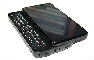
Two years ago Nokia’s future was going to be Maemo, a cutting-edge operating system based on Linux with a sleek interface to replace the veteran Symbian OS. The phone that would bring it was the N900. This had the same processor as the rival iPhone 3GS, plus a much better screen and camera, neat slide-out keyboard, a kickstand and great stereo speakers for watching video, and even features the iPhone lacks to this day like real multitasking and a memory card slot.

As Nokia had been and was still the leading maker of smartphones, you might imagine a pent-up market of loyal customers gagging for a device that would show that upstart Apple. Yet when it arrived they stayed away in droves. The N900, very arguably the most advanced and capable phone yet made, was a magnificent, absolute, utter market failure.

What the hell went wrong? More than one thing, clearly. A phone with that much going for it could surely have survived one weakness, maybe even two or three, and still gone on to be a big seller.

Four though is pushing it.

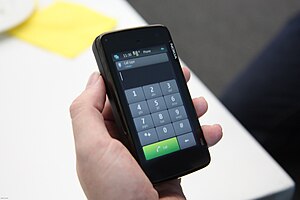
Nokia N900, dial mode.
Not its best angle

The other week I showed it to an iPhone-using friend. She was interested, but asked – quite innocently – “Why is it so thick?” It’s true, it’s as thick as a brick. Downright chubby. Though its other dimensions are almost identical to the iPhone 3GS, it’s half again as deep. Is that such a bad thing? Thickness is actually a practical advantage in a phone, there’s little chance of cracking this one in your pocket. But such arguments weigh little in the scales of fashion. People have to be slim, therefore our phones have to be slim too – that seems to be about all the logic there is to it.

An even more damaging shortfall though was the strange absence of multitouch. Perhaps Nokia had too little experience with the necessary screen technology, but launching the N900 without a modern interface was like naming a ship “Abandon”. A resistive screen with a stylus for tapping little icons was an interface from obsolescent Windows Mobile and historic Palm devices. Nobody wanted one now.

Nobody, except a few freaks such as myself. Resistive is far better suited to drawing than the capacitive type of screen used for multitouch. Capacitive requires a large contact area with the surface, making precise detail impossible. Plus it lacks any dimension of pressure sensitivity, while resistive screens can be highly responsive to changes in the pen press.

Combined with pressure-aware Linux drawing applications like MyPaint, this ‘outdated’ resistive interface allowed realistic pen-like or brush-like drawing strokes. This made the N900 the best phone ever created for art,¹ a powerful but sensitive digital sketchbook you could carry in a pocket. Many of the cartoons appearing on this blog were done with it – pencilled, inked, coloured, lettered and uploaded without ever seeing paper or PC. You can even edit images with GIMP, a program with capabilities comparable to the full desktop version of Adobe Photoshop.

But the very thing that most endeared it to me was a huge turn-off to the wider public.

English: Nokia N900 communicator/internet tabl...
Looks better this way

Then there was the lack of apps. As Apple were first to realise, shopping is part of the experience now. A phone is nothing without stuff you can buy for it. There are some very good apps available for Maemo – but almost none to buy. Its Open Source Software roots meant that people were keen to contribute useful stuff. With a little tweaking it could even run apps built for desktop Linux. But that actually worked against a market for the Maemo platform. Professional app developers were discouraged by having to compete with free.

And this cultural clash, Open Source on one hand and commerce on the other, created other unforeseen problems. If you’ve got an issue with a community-developed program, to whom do you complain?

You don’t. In the cooperative world of OSS you file a bug report, documenting the issue and the circumstances that produce it. Which is lovely, but customers who’ve paid money for a fancy phone hardly expect to have to help out as well.

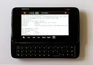
English: The Nokia N900 showing system informa...
Terminal: Fatal

Nor do they expect tech support that tells them to open a terminal window and enter Linux commands. That isn’t actually as intimidating as it might sound, but “Buy this and soon you’ll be learning Linux” is not the sort of slogan that say Apple would use. Or indeed anyone who wanted to sell anything.

And yet… It was so damn promising. If they had moved quicker to smooth off the edges of Maemo, if something like the N9 had arrived a year earlier – while people were still actually waiting for it – it might have been a hit instead of a peculiar footnote². Instead, Nokia paid brutally for not getting their collective arse in gear.

But, it was a remarkable achievement and a fascinating experiment. Even when it’s no longer my primary phone I’ll keep the N900 around, especially for travel, as an incredibly miniaturised PC. They can be picked up new on Ebay for under $200 now, I recommend them highly.


___________________________________________________________________

  1. Though Samsung were later to make the impossible dream come true by putting an actual Wacom digitizer on a phone.
  2. A footnote to the footnote: There are rumours that Nokia have quietly continued their Linux-based development – just not for smartphones. Dubbed Meltemi, a descendent of Maemo is rumoured to be the future replacement for the S40 “dumbphone” system that has done so well for them for so long, and could be used to bring smartphone-like features to low-cost devices. That might prove competitive against the rising tide of (frequently awful) cut-price Androids. A sad end for the noble Maemo maybe, but it could save Nokia’s bacon – and of course make them less dependent on Microsoft. Who’s to say that a Linux smartphone will not rise again?
Categories
Technology

No Compromise: Introducing The Galaxy Note

©SamsungThere are phones and there are tablets, and basically the only difference between them is size. But that difference is not trivial. Far from it; in mobile technology, form factor is everything. Difference in size means difference in purpose. A tablet is as big as is comfortable to use for ‘media consumption’ on the couch, a phone as small and portable as it can be while remaining usable. Anything intermediate is a compromise that falls between stools. Such is contemporary design wisdom.

And it’s wrong. People use their phones more and more for browsing, reading, viewing media and playing games. All else being equal, these will always be better on a bigger screen. So it’s very arguable that the best portable device is the biggest one you can comfortably carry. How big is that though, exactly?

Bigger than you might expect. Samsung‘s view – and I tend to agree with them – is that the upper threshold is what you can easily get in and out of an ordinary jeans pocket (video). In most ways, their new Galaxy Note is just an upgraded version of their popular Galaxy S II. What sets it apart is its simply humongous 5.3″ screen, surely as big as a mobile phone can get and still remain mobile. That’s not a compromise, that’s pushing an idea to its extreme. Seen this way it’s the recent generation of 7″ Android tablets that fell between two stools – smaller than the iPad, but not small enough to be truly portable.

Some reviewers have worried about looking foolish, holding such a large device up to the face. Well yes, maybe this is not the phone for the overly self-conscious. But I suspect it will attract more glances of interest, even envy, than amusement. It’s not merely the size of the screen that makes it stand out. With its resolution of 1280 x 800 – higher than the iPad – and luxuriant saturated AMOLED colours, it’s gaining a reputation as one of the most beautiful ever seen on a mobile device.

©SamsungBut the controversies only begin with the Note’s size. There’s also that pen. How can the addition of an input device somehow be a fault? For this we can blame Steve Jobs. Making a dig at the original Windows Mobile, he said “if you see a stylus, they blew it.” He was wrong too though. If you need a stylus they blew it, sure. Poking at tiny icons with a stick is not cool. But the Note has a touch interface as good as any of its rivals. More than one review has seemed almost to take offence at this. If you don’t need the pen to use the phone, what’s it doing there?

For sure, it would still be a fabulous device without it. You could use the Note merely as a huge-screened Web browser, HD video player and camera, e-book reader, satnav, tablet, gaming device etc. without ever withdrawing the pen from its bay. But for others – myself included – that pen is precisely the reason why we’ll be giving our money to Samsung. This is no plastic stylus. An advanced, sensitive pen would be a brilliant complement to a device big enough to use like a notebook. And once again Samsung has not cut any corners, using gold-standard technology from Wacom, makers of the Intuos and Cintiq tablets found in graphics studios worldwide. The sketching, annotation and handwriting possibilities this “S-Pen” adds put the Galaxy Note into a league of its own. Or would, if its screen hadn’t already.

It may not be on its own much longer though. It’s being joined by a rival product from fellow Koreans LG. Their Optimus Vu will have comparable dimensions and also comes equipped with a pen – rejoicing in the name “Rubberdium”. (No clues as to what the technology is yet, but they describe it as dedicated so it is probably an active device.) And it may be far from the last. The fourth iteration of Android, with its ability to scale to different screen sizes and its inbuilt support for pens, seems tailor-made for devices like this. (The Note does not actually have Ice Cream Sandwich yet, but will get it as soon as it’s ready – possibly next month.) With these features clearly part of Google’s vision, will we be seeing a phablet from Motorola next?

I hope so for the sake of diversity, but speaking for myself it’s hard to imagination any device in the near future improving on the Galaxy Note. Wacom technology appearing on a phone is a long-held dream I seriously thought would never come true. So I want to use this more than any device I’ve seen in nearly ten years. And frustratingly, about anywhere in the world seems to be getting the Note before Ireland. Vodafone has at least have confirmed they will be carrying it though. No details on pricing yet, but if you want you can register your interest here and get notified as soon as it goes on sale.

Just one question remains then – what will we call this new class of device? Phablet seems to be catching on, even if some abhor the word. Well, it’s not as bad as tabphone or phoneblet. I have a different suggestion though. We could take a word that technology has made redundant and give it a new job. Let’s call it the Phonebook.

%d bloggers like this: