Categories
Spacelab

Introducing: Galway Trails

[A Design Case Study]

Galway Trails, my most recent Website project, was a lot of fun to make.

Much of the time I do websites for artists, so the imagery is basically done before I arrive – take Natalie’s or Kevin’s, two recent ones for painters. This is wonderful, because the thing a website needs more than any other is good pictures.

New Imagery

In this case though the client was Jim Ward, a tour guide. Photos of the places Jim guides people around therefore would be a vital element of the design. He didn’t have all the ones we would need though, so I had an opportunity to create imagery for a site myself.

It was not one I was going to miss.

Signed Me

Photography has always been like the fourth or fifth string to my bow, (which itself doubles as a small harp); it was what I wanted to do when I left school in fact, though I soon found that the sort of work you could get paid for – event photography, basically – was insanely stressful if you only had a basic manual SLR. Imagine trying to capture that perfect moment, from the perfect angle, while simultaneously adjusting focus, aperture, exposure time, focal length, flash intensity… I had to give it up in the end because I could never forgive myself for the moments I lost.

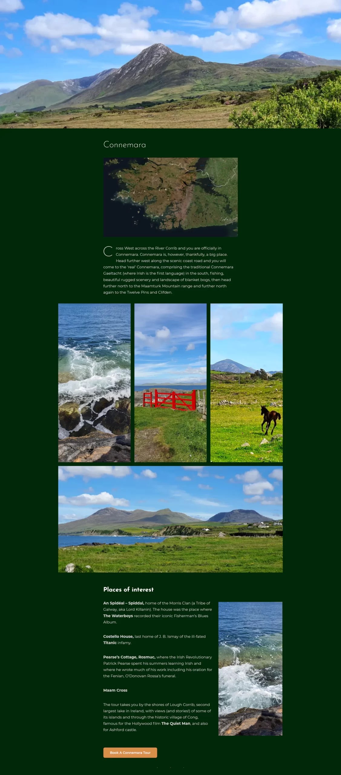
But scenery is patient, so I never lost my love for landscape pictures. As you may remember we were highly fortunate with the weather this summer, and my partner and I were planning to go camping anyway… Into the van and off to Connemara we shot. It was a lovely weekend. I never stopped taking pictures, because there never stopped being a thing that looked like a picture.

Here’s a few we couldn’t fit into the site:

Where, as they say, would you get it?

Existing Images

But that was later in the process, after travel restriction were lifted. Earlier I had to work with what pictures we had. Some were great, but others were not so inviting.

The Cliffs of Moher, as you would not particularly wish to see them

It has a certain brooding magnificence, but if a tour guide’s site is anything it’s an invitation to come outdoors, and an image like this did nothing to make me want to leave the comfort of my duvet. I was sure it would lose Jim customers.

We could have bought in stock images, but the budget was tight. And anyway I really liked this view; it was just the light that was wrong.

Time to put the coffee pot on and get Photoshop revved up…

Cliffs of Moher, enhanced
Moher on a good day – Albeit one I made up

It’s almost scary, isn’t it? Sometimes Photoshop feels like the great power that brings great responsibility.

In theory I could have made most of the pictures look like they were taken on nice days – the ones where there wasn’t visible water on the ground at least – but that would’ve felt dishonest and looked boring. So for most of them I chose not to tweak the weather…

…so much as the drama.

This is from Jim’s tour of the places and events of the 1916 Easter Rising in Galway. (Yes, it wasn’t just Dublin.) This was the most challenging part of the site, because we had little to work with except pictures of monuments.

The tour of course is not about monuments. It’s about the events of that day, and it’s about hearing the story of those events in the places where they actually happened. And as well as Jim being an experienced storyteller, his account of those events is lent weight by the fact that his own grandfather took part in them. So the goal was to take those photographs and make them look as compelling as the tour would be. I’ll let you judge whether I succeeded in that.

Click to view larger

Layout

This 1916 tour section is a good example of the layout I chose for the site as a whole: A single column, with images that “spring out” on anything wider than a phone. It’s an approach I like for sites with a substantial amount of text because it keeps the words easily readable, no matter how wide the screen, while making the most of the available space for images.

Home Page

Structure

This is how the home page looks on desktop – if you could see the whole thing at once without scrolling. Essentially, it’s a stack of four full-width screens:

Click to view larger
  1. The logo, menu and header imagery, with a succinct explanation of what the site is about and a nice big pressable button (what marketers like to term a “Call to Action”).
  2. A bold image slider, with links to the main sections of the site.
  3. A more detailed introduction to Jim’s tours, containing all the essential keywords and links to all parts of the site.
  4. A big iconic image, and the footer.

I’m particularly fond of the photo of Galway’s Quay Street at right, because it’s actually a composite of two shots. If you look closely you can probably see the stitching, but it’s not really visible at the size it displays on the site.

And also, because it was one of the first images of Quay Street actually looking like Quay Street for well over a year.

The picture of the notorious Lynch Window on the left was from an afternoon when I really went to town. The light was good and from the right direction, and I shot the pictures in “Raw” so I could get the best from them.

(If you remember film photography well enough to indulge an analogue analogy, using Raw is like doing your own developing and printing in the darkroom instead of sending the film off to a lab.)

I got far more material than we actually need yet, so we set most of it aside to go with posts that Jim may add in the future. Meanwhile though here’s a couple of favourites:

Header Background

Something Jim was keen on using in the design was the iconic 1651 map of Galway city. I was well on for that, I’m a big fan of the 1651 map myself. It’s a fantastic bit of late-renaissance cartography. Also my house is on it. So I decided to put this enigmatic image literally front and centre.

Map as it first appeared in 1651

Considered as an image though it is a little plain and grey, despite its fascinating detail. And that very detail makes it a bit too distracting to be used in the background. What can I do with it?

Map as it was messed with in 2021

First I pare it back to the old city walls. Now it’s less a map, more very much an engaging shape. Kind of reminds me of the Mandelbrot set.

But it’s still grey. Grey map. Grey…dient map. How about a gradient map?

This is where you choose colours and “map” them onto the tones of a black and white image. One closely related to the background say, with another to contrast with it in a vibrant way.

OK maybe a biiiit over the top, the lime green. But I like the effect. Now is the time to think hard about what the site’s background colour is actually going to be.

I like this one, but it’s still probably too intense.

OK that has a nice historic feel to it, and I think it hits the right balance – muted enough to work in the background, but mysterious and strong.

Header Foreground

For the foreground, I wanted an image that shouted “This is a website about guided walking tours!” Jim had one which I thought was pretty much perfect:

Jim with a group of young adult walkers on a trip to the ancient fortress of Dún Aonghasa on the Aran Islands

Functionality

Obviously, function number one of the site is to get the word out there about Jim’s guided tours; close second to that though is taking bookings for them online. That of course makes this an e-commerce site, and in Ireland we’re fortunate at the moment to have a great scheme to help people start out in e-commerce. The grants are administered by the system of Local Enterprise Offices and so are colloquially known as “LEO Vouchers”, though the official name is the Trading Online Voucher Scheme. It offers up to €2,500 towards the cost of a site, which is great.

Until we turn online booking on, visitors can request guided tours using this form (Click to see larger)

(If there is a disappointment, it’s that it used to be not merely great but downright fantastic. Now the scheme covers 50% of your costs. That’s really good if you need a €5,000 site and have €2,500 to spend. But in its first phase the scheme would cover 90%, which was ideal for someone starting out. Basically you could get a sophisticated, money-earning website for €250 or less.)

Just one hitch: While the online booking system was the main e-commerce aspect of Jim’s site, he doesn’t want to take online bookings right now as the tourist season is over. So I designed the booking system, and then hid it.

QR Codes

Jim hasn’t recorded any of the audio guides yet, but – if it’s still up – this code will let you download an exclusive recording live from my bathroom of me saying “This is just a dummy podcast to test the system”

We needed another e-commerce aspect to fulfil the grant criterion therefore, but there was one Jim wanted anyway: Selling audio guides. Specifically, he wanted to put up QR codes on signs or posters at various points of interest so that people could scan the code and, for a small fee, download an audio file of him telling the story of that place. That struck me as a great idea, and I worked hard on finding a good simple way to make it work.

Client User Interface

Another thing I like to do for clients is create a customized control panel. As they tend not to be experts with WordPress themselves I generally do the admin duties for them (covered, along with site hosting, maintenance, and backup, by a small annual fee), so they can be spared the stark confusion that is the WordPress admin-level interface.

To be technical a moment, I usually give clients “Editor” privileges, which is just enough power to change any content on their site without being burdened with under-the-hood stuff. But even that level presents you with a vast array of knobs and dials. So I make them a hand-crafted panel with just the few controls they’ll need for creating blog posts or new products and uploading images (and in this case, audio).

It also includes a brief manual, with instructions and screenshots to help them go about these tasks.

I have to confess, I enjoy how self-referential this image is

(Though once in a while a client gets so good with WordPress that I give them full “Admin” level access and just let them run with it. Isabelle’s is a great example. The site I designed for her a few years ago is in there somewhere, but she’s really made it her own.)

A Vector Logo

I included designing a logo for Jim in the price, and was determined to make it a proper one that he could use for all of his publicity materials, online and in print. Therefore it had to be in vector format.

Vector What Now?

Most images you see are made out of dots of colour; pixels on a screen, spots of ink in print. When we talk about resolution, what we mean is the size of these dots – they have to be so small that the eye doesn’t notice them individually. If you enlarge a picture bigger than it was intended to be, you see the dots and the illusion is ruined.

This is where vectors come in. Instead of using dots, a vector image is made up of curves described mathematically – like the curves on a graph. These don’t have any resolution; they can scale as big or small as you like and still look perfectly sharp. This is why they’re preferred for things like logos.

I’d decided at quite an early stage that the hooker, the traditional working sailboat of Galway Bay, should probably be the logo image. It may be a little obvious but it’s nicely iconic – and highly suitable, as Jim does tours that take the boat (no longer a hooker, alas) to the Aran Islands.

And it’s red because the sails of a hooker are traditionally red. This was one of the reasons I went for a moss-green background for the site, to set that off well. As you saw in the header examples above I was considering shades of maroon at one point, because maroon is Galway’s official colour. But sadly it’s also a damned hard colour to work with, and it certainly wouldn’t have gone as well with a red logo.

Creating a vector meant firing up Adobe Illustrator, a program I’m no expert with. Fortunately my partner is, so she gave me a lot of pointers. In brief: If you’re used to Photoshop it’s exactly like using Photoshop, except backwards.

A Galway Hooker with sails that are definitely not maroon

Also fortunately, before I started drawing the boat it occurred to me that someone had probably done that before. I was able to pick up a nice vector hooker for surprisingly little. (Quiet at the back.) I just had to bring it in to Illustrator and add the lettering. Bearing in mind the various circumstances in which you might want to use a logo I kept it simple.

And there we have it, a logo Jim can use on everything from business cards through t-shirts to billboards. All part of the service.

Conclusion

I’m an all-round Web person. As well as doing design and development (the nitty-gritty technical stuff that comes in three-letter acronyms), I create content too. A lot of the time the client will want me to edit or even write the text for their site.

Jim Ward however, as well as being a tour guide, writer, and playwright, also creates content for websites and online marketing himself – both in English and in Irish – at emaginet.ie. So I had no work to do there! But I got to go wild with images, which made for a lovely change.

Thanks, Jim. It was a great project.

Categories
Spacelab Technology

You’ve Got Style

As the saying goes, you don’t know what you’ve got till you’ve gotten shot of the damn thing. To really get what’s cool about modern Web design, you need to know what we had to put up with over its chequered history. So strap in, things are about to get condensed!

Did you ever wonder how Web pages got so attractive? You can remember, I’m sure, when they looked liked amateur Word documents, with the height of excitement being some moving text or a background apparently chosen give you an ice cream headache. Why was that?

Back in them ancient days, styling a website was not impossible. But it was awful. Your typical bit of HTML code would look something like this:

<h1>Your Heading</h1>
<p>Yadda yadda, herp derp etc.</p>

That’s how you’d make a paragraph with a heading above it – it hasn’t really changed to this day. You put words between tags, which tell the browser how to display them. Back then though the browser would use its own default styles – which on most computers meant plain black text, sixteen pixels high for the “p” (paragraph) text and twice that for the “h1” (main heading), in the dreary Times New Roman font. So like this:

Your Heading

Yadda yadda, herp derp etc.

Default styles incidentally are still a thing which you can see – and mess with – in your browser’s settings. Though most sites override them with their own styles there are still some that don’t.

I have an old font which I made from my own hand-lettering, and sometimes I like to pretend I wrote Wikipedia.

So how did you, as a Web author, put in your own styling instead of this awful default stuff? Well, with difficulty. It went pretty much like this:

<h1 style="color:red">Your Heading</h1>
<p style="color:darkslategray">Yadda yadda but in grey now.</p>

You insert some styling information into the tags themselves, which the browser displays like so:

Your Heading

Yadda yadda but in grey now.

OK… Not too hard. Let’s try to change a few more things:

<h1 style="color:red;font-family:Helvetica,Arial;font-size:36px;font-weight:normal">Your Heading</h1>
<p style="color:darkslategray;font-family:Helvetica,Arial;font-size:18px">Yadda yadda only better.</p>

Which renders as:

Your Heading

Yadda yadda only in a nicer font.

Let’s face it, it still looks like utter dogfood. (Must remember to turn off the profanity filter.) It’s nothing compared to the powerful typography used in posters or magazine layouts. And it’s getting complicated fast. What’s worse though, you’ve only styled a single paragraph. Imagine doing that for every paragraph in your page.

Then imagine doing that for every page in your site.

And then imagine the day you wake up to find you no longer like the colour “darkslategray”… Even with multi-document search-and-replace, editing every one of those style instructions across the whole site is depressing just to contemplate.

So Web design was a complete pain in the early years. Tedious, inflexible, highly restricted. And then, along came Cascading Style Sheets (CSS)!

The Revolution

Well actually they’d been there all along, in theory. Håkon Wium Lie had the idea while working with Tim Berners-Lee and Robert Cailliau at CERN right back in 1994. It was always part of the plan for the World Wide Web, but it took considerable time for browsers to catch up with it.

So what does it mean then, Cascading Style Sheets? Well, ‘style sheet’ simply because all the styling that used to be stuck all over the place in tags was now gathered into a single document. So instead of…

<p style="color:darkgray;font-family:'Courier New';font-size:18px">God help us, not again.</p>

…for every single sheeting paragraph, you just write…

p {
    color: darkgray;
    font-family: 'Courier New';
    font-size: 18px;
}

…once and that’s your work done for the whole meter-parking site. YES!

Ahem. And the ‘cascade’ part of the name? That would probably take a whole other article to fully do justice to, but put crudely it means that the specific overrides the general. Styles in the style sheet apply to the entire site, but these can be overruled by styles specifically for one page, which can in turn be overruled by styles right in the tags just like the old-fashioned examples above*. They flow together in a consistent and logical way, allowing you to create a unifying theme for your site as a whole and then tweak that with styling specific to different sections. In Spacelab for example, as shown in our featured image up top there, each page shares the same fonts and colour palette but has its own unique background.

Thanks to the powerful CSS language, all the aesthetics of your site, all the fonts, colours, backgrounds, shapes and sizes – and far more these days, up to and including animations – can and, where possible, should be written in one single document: your style sheet. It’s hard to convey what a huge… relief it was when I first designed this way. Suddenly you could change a whole site at a brushstroke. It was the dawn of a new age of creative freedom.

*There is never a very good reason to put styles in the content like that now, but if it wasn’t allowed then older Web pages wouldn’t work any more.

Yeah. About a week after I wrote this, I embarked on a project where some styling within the content was just the thing needed. But it was an extremely unusual situation.

Categories
Spacelab

Making It Mobile

So let’s talk about making your website work on mobile devices.

Or to be a smartarse about it, making it work on a big screen – because naturally you designed it first and foremost for mobile. We all do that now, right?

I don’t think it matters all that much; even the idea that one must come before the other strikes me as a holdover from print design. What should really come first is an intense and almost Zen-like awareness that you’re designing in a fluid space. So while it’s tempting to approach them separately, there’s so much overlap between the dimensions of desktops, laptops, tablets and mobiles that it’s hard to draw any clear line between them. To my mind the best approach is to create one design that can smoothly adapt itself.

‘Responsive’ is the key word here: design that responds to the shape of the browser window or phone screen that’s displaying it. (The ‘viewport’, to use the terminology). You want things to change their position and size to use the available space attractively.

My partner designs for Web too, and it irritates her when she hears people use the term ‘pixel perfect’ like it was somehow a good thing. Defining the position of everything in your site in terms of the actual pixels – the individual illuminated dots that make up the image – may have made sense back when screens came in two different sizes, but those days are gone. Long long long looooooong gone. I flinch now when I see a website squeezed into a 1024-pixel runway down the middle of the monitor.

Don’t get me wrong, the pixel has its uses as a unit of measurement. It’s just that they’re… rarely good uses. My rule is that if you’re using them, you’re probably missing an opportunity to do something better.

(And the same goes for the other absolute-length units like millimetres or picas – or even inches. Did you know you can lay out a web design using inches? Seriously, it’s part of the spec. I’ve never seen it done, I can’t imagine why you would want to do it. I kind of want to do it now… Inches. Wild.)

The fundamental unit for responsive design is the percentage. Declare some area to be say 50% wide, give it margins of 25% either side, and it will sit in the middle of whatever area that contains it. Beautifully simple. There are other proportional units, including some weird but cool new ones like ‘rem’ and ‘vmax’, but percentage measurements are to responsive design as big stone blocks are to pyramids. Think of a pyramid made out of stretchy, bouncy blocks. No wait don’t, that’s stupid. What I’m saying is that if you describe your lengths with percentage units, the size and shape of the screen no longer matter. The layout shuffles around to fit. It really is as simple as that.

OK it’s not, there’s usually more you have to do to make a layout look good on every screen. But it’s the foundation. The new home page of Spacelab.ie – pictured here as it appears on both desktop and mobile – is a rare example of an almost purely proportional design.

Even here there are a few cheats; those transparent navigation tabs at the bottom right for example will have text behind them on narrower screens, so they turn opaque to keep the labels readable. The official name for these cheats is ‘media queries’, clever little rules that tell the browser to change its behaviour when the shape or size of the viewport changes. These are what make responsive design possible for layouts of any real complexity, and they are excellent.

But as simple as they may be, using media queries can get complex fast. I’ll return soon with tips for how to avoid that. In the meantime, I invite you to enjoy the fluid simplicity of the new Spacelab home page.

Go on, open it up and pull the corners around.

Categories
Cosmography

So How Come You Never Blog Any More?

This may answer your damn question…

Print proof of the cover of our brochure. Image by Harry Burton, other bits designed by Paul Callanan, Sarah Bruzzi, and myself

I used to have time. Now I am part of what is rapidly becoming the largest and certainly the most international cartoon festival in Ireland.

Don’t ask me why. It’s not really my idea of fun. I’m working with some great people but, as a long-time freelance artist I’m utterly crap at working with people.

I get to deal with some great artists from around the world, but end up feeling like every one of them is better than I am.

In many ways, this seems like a scheme I invented to depress myself. We did it twice, and twice I vowed I would never do it again.

But this is the third time.

Because what we did get done wasn’t too bad. Actually we did something pretty good.

It’s going to be good again. Watch this space: galwaycartoons.eu

Categories
Cosmography Humour Politics

Goodbye Jeremy

I remember running into Jeremy Hardy after a gig in Róisín Dubh a few years ago. Having been a serious fan of his work for over twenty years, I gave him a nod of recognition. Having never heard of me in his entire life, he returned the greeting. That was the kind of guy he was – warm, open, maybe a little short-sighted.

Alas, I didn’t get a chance to chat with him. But what would I have said? Probably something embarrassing like how, in one of those weird and deeply meaningful coincidences, our parents had the same first names. I’d have a looked like an idiot, and for good reason. But what can you say to someone you genuinely regard as a hero?

If I could have found the words, I would have said he was the most insightful, important, and consistently funny comedian I knew. Which would be true, but also wrong. In a lot of ways he wasn’t a comedian, primarily. Comedy was the means, but the aim was to change the world for the better. His seemingly unstoppable comic inventiveness was employed to spread a passionate message of tolerance, sanity, kindness. And he succeeded in that aim. The world will be a less kind, less sane place now he is gone.

Britain in particular will miss him sorely. Recently he seemed almost the last voice of sanity left in that benighted place. He was certainly one of the very few British comics who understood Ireland. Perhaps the most tragic aspect of his sudden departure is that we needed him today more than ever.

All these things I would have wanted to say, now it’s too late. And there would never have been a way to say them anyway.

Categories
Politics

Repeal

Ireland is voting today to remove a constitutional amendment inserted 35 years ago. This did not, as many understand, outlaw abortion. That was already long forbidden in the Ireland of 1983. It went much further than that.

The Eighth Amendment created a whole new legal entity called ‘the unborn’, with a right to life equal to any human being — and specifically, to that of the woman carrying it. Oddly the amendment does not define ‘unborn’, but that didn’t seem necessary at the time. The entire debate was framed within the context of the Catholic teaching that personhood begins at conception. While that wasn’t a practical criterion, a human being does exist in law as soon as there are detectable signs of pregnancy — when its equal right to life inevitably casts uncertainty over medical practice, putting women’s lives at risk.

When you think about it it’s bizarre to treat a pregnancy, from its very outset, as equal in humanity to an adult woman. A new person is there when she has finished giving it life, not from the moment she starts. That is plainly obvious to a detached observer. To see something else requires religion.

According to the religion, life begins not when a woman has completed her role in the process, but when the man has completed his. Gestation, birth, nurture, all that stuff is details. When the guy rolls off and farts, that’s the miracle.

Thirty-five years ago, some religious people put their strange ideas into our Constitution; ideas that betray a deep distrust, even fear, of women. Today we have a chance to put it right again.

Categories
Cosmography Humour Technology

One in 1,000

Sonocardiogram machine.

One in one thousand.

That’s how many people die during an angiogram, according to the warning on the consent form I had to sign. This is a rather distracting thing to learn just a few moments before you undergo the procedure.

How dangerous exactly is one chance of death in a thousand? Well, it’s more than 160 times safer than Russian roulette. That sounds… good. On the other hand if one breakfast in a thousand was lethal, you’d be dead within three years. So breakfast needs to be way, way safer than that.

These are the thoughts that pass through your mind as you lie on a narrow operating table, while someone makes a hole in your wrist and slowly threads a fine tube up an artery in your arm all the way to your heart.

Now that’s quite a novel sensation. If I had to describe it in one word, the one I’d choose would be… wrong. Not painful as such, just… wrong. That is not a place where you should ever feel something moving. It was a challenge to stay calm. And yet you had no choice. If my breathing became more anxious and deep, it moved my heart too much. So I had to maintain even, shallow breaths while undergoing one of the weirdest sensations – and weirdest situations – of my life. They were injecting X-ray dye directly into my heart.

And that’s where it got really interesting.

“Of your three coronary arteries,” said the cardiologist, “two are fine. The third however is almost completely blocked, so we’re just going to pop a stent in there.”

Well, that’s quite a bit to take in at once. For a start I turn out to have heart disease, when I was still steadfast in the belief that I was having this (one chance of death in every thousand) procedure just to rule the possibility out. I was almost sure it’d turn out to be a duodenal ulcer or something. But it’s much easier to fool yourself than it is to fool medical scanning devices.

But the real headshot – they were putting a stent in now? Well I suppose it makes sense. I mean, as they’re literally here inside my heart already. Doing it again would raise the risk of death to one in 500, which clearly does not have enough zeroes after it. But… right now?

I know, when I was signing the consent form they did say something like “… and if we find a blockage we can insert a stent”. But I’m sure I didn’t hear the words “while we’re at it”. Unconsciously I’d expected some kind of consultation, with nice diagrams and maybe even counselling, before taking such a big step as having metal scaffolding inserted in my heart.

And maybe it was like that, twenty years or so ago when stents were new technology. But now they seem to be taken for granted. Hell they’re made in a factory down the road, by people I know personally. It’s all quite normal now, my head says. But my heart…

My heart was straightway overruled. It was a little painful – actually it felt exactly like one of the attacks of angina I had so easily dismissed as indigestion – but I am a cyborg now. Well, a slightly cyborg.

I’m writing this while recovering in the cardio-pulmonary ward. It’s all been very fast and a little unreal, but apparently I got here in the nick of time. If the doctor hadn’t sent me in just as soon as I described the symptoms, and if they hadn’t processed me through the system about as quickly as possible – just over 24 hours is not so shabby for heart surgery – I would almost certainly have had a heart attack. And probably sooner rather than later; that artery was 95% blocked.

But even the disease was sudden. The pain had only become a regular occurrence in the last two weeks, which is why I had put it down to gastric trouble induced by festival worries. Can heart disease really strike so fast, or were there earlier warning signs I’d missed, months or even years before? Things like the unexpected shortnesses of breath, sharp headaches after exertion, even the temporary memory loss I had two years ago?

I wonder how many of the various illnesses I’ve had in recent years were ultimately due to a heart under pressure. And in what ways I will now feel more well, thanks to a bit of metal in my chest. I look forward to finding out.

Categories
Cosmography Politics

Corridors of Poor

The first thing to note is, there’s no such thing as downtime any more. Not if you can work on a mobile device. So here I am, waiting in an emergency room to be seen by cardiology for reasons that are almost certainly stress-related, and what do I find myself doing?

Actually drawing cartoons. Uploading news and pictures to the Galway Cartoon Festival page. Getting shit done.

Well it’s better than just sitting around, recovering. But in truth I can think of few things more stressful than being forced to do nothing. So this here is my compromise – blogging again. Meaningful activity, but not something I really have to do. So it feels like letting go, taking mental fresh air and exercise. We’ll see how long that lasts…

Yeah, I have taken it all a bit too far. Again. The Galway Cartoon Festival is one of the largest projects I’ve attempted in my life, and it feels like it. But on the bright side, it isn’t certain that I’ve blown my heart up. I think I’ve probably just got a bad ulcer or something. But the chest pain is ambiguous and they want to keep me in to make sure.

So what does “keeping me in” entail, a night on a trolley in a corridor?

I should be so lucky. At the moment it’s nearly 2am, and I’m still in a queue for a trolley. This is a statistic you don’t see published much – the national trolley shortfall.

As the title suggests, I am not seeing a lot of people here who look conspicuously well off. I wonder where they go when they are knocked down or have heart attacks? Perhaps here first, it can actually be very efficient – as a suspected heart patient I was was having an ECG in minutes. But I doubt they stay long.

Here where there is masking tape over cracks in the wall to keep the mold in. Where a man suffering from psoriasis asks for hours to get medication for the itching. Where a woman with epilepsy being held for “observation” has a seizure while no one is looking. These are just the things that happened right in front of me.

In the background meanwhile we have the groaning, the constant bleeping of alarms, the merry sound of vomit as the first alcohol victims arrive. And my God the coughing, everywhere. I’m here just in case I’m seriously ill. By morning I guess there will be no question.

Categories
Cosmography Politics

What The Hell Happened There?

tmp_14057-sergcartoon_31-1743240768

Donald Trump wouldn’t make a convincing secretary at a half-decent country club, yet until recently he seemed a serious contender for leader of the world’s most powerful nation. That requires some explanation. It’s not credible to say that people are only beginning to realize that he’s a piece of shit. For decades he’s been famous precisely for being a piece of shit. He threatened to run for President several times before and was greeted with laughter and disbelief. Yet this time he almost went all the way, even securing the candidacy of the party which, after two Democratic terms, should have been clear favorite. What made this time so different?

Obama, naturally. Previously presidents, Republicans especially, were authority figures, high-status patrician males. And yet now the President is a black man. Which, if you’re a mindless racist, means he has lower status than you. How can you even compute that information? Either the black man can’t really be President – he must be Kenyan/Muslim/Communist/Hawaiian. Or… anyone can be.

For the first time, dumb racist losers actually believe the American legend – that they could grow up to be President. Or if not them personally, then at least that rich one from TV. Commentators have said that Trump’s followers represent the lost and disillusioned. I disagree. What we’ve learned from this election cycle is that America’s scumbags have never been more inspired and motivated.

Categories
Cosmography Technology

Mertrucks