

[A Design Case Study]
Galway Trails, my most recent Website project, was a lot of fun to make.
Much of the time I do websites for artists, so the imagery is basically done before I arrive – take Natalie’s or Kevin’s, two recent ones for painters. This is wonderful, because the thing a website needs more than any other is good pictures.
New Imagery
In this case though the client was Jim Ward, a tour guide. Photos of the places Jim guides people around therefore would be a vital element of the design. He didn’t have all the ones we would need though, so I had an opportunity to create imagery for a site myself.
It was not one I was going to miss.
Photography has always been like the fourth or fifth string to my bow, (which itself doubles as a small harp); it was what I wanted to do when I left school in fact, though I soon found that the sort of work you could get paid for – event photography, basically – was insanely stressful if you only had a basic manual SLR. Imagine trying to capture that perfect moment, from the perfect angle, while simultaneously adjusting focus, aperture, exposure time, focal length, flash intensity… I had to give it up in the end because I could never forgive myself for the moments I lost.
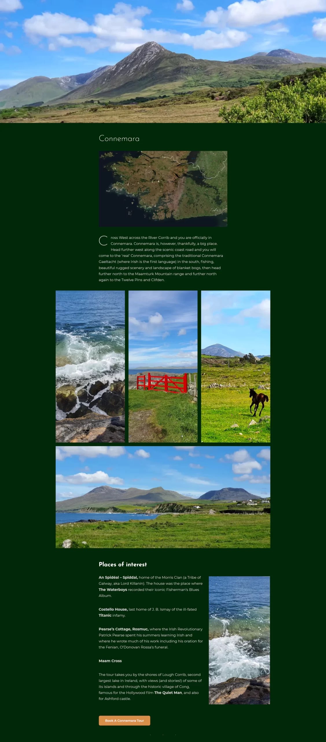
But scenery is patient, so I never lost my love for landscape pictures. As you may remember we were highly fortunate with the weather this summer, and my partner and I were planning to go camping anyway… Into the van and off to Connemara we shot. It was a lovely weekend. I never stopped taking pictures, because there never stopped being a thing that looked like a picture.
Here’s a few we couldn’t fit into the site:


Where, as they say, would you get it?
Existing Images
But that was later in the process, after travel restriction were lifted. Earlier I had to work with what pictures we had. Some were great, but others were not so inviting.

It has a certain brooding magnificence, but if a tour guide’s site is anything it’s an invitation to come outdoors, and an image like this did nothing to make me want to leave the comfort of my duvet. I was sure it would lose Jim customers.
We could have bought in stock images, but the budget was tight. And anyway I really liked this view; it was just the light that was wrong.
Time to put the coffee pot on and get Photoshop revved up…

It’s almost scary, isn’t it? Sometimes Photoshop feels like the great power that brings great responsibility.
In theory I could have made most of the pictures look like they were taken on nice days – the ones where there wasn’t visible water on the ground at least – but that would’ve felt dishonest and looked boring. So for most of them I chose not to tweak the weather…


…so much as the drama.
This is from Jim’s tour of the places and events of the 1916 Easter Rising in Galway. (Yes, it wasn’t just Dublin.) This was the most challenging part of the site, because we had little to work with except pictures of monuments.
The tour of course is not about monuments. It’s about the events of that day, and it’s about hearing the story of those events in the places where they actually happened. And as well as Jim being an experienced storyteller, his account of those events is lent weight by the fact that his own grandfather took part in them. So the goal was to take those photographs and make them look as compelling as the tour would be. I’ll let you judge whether I succeeded in that.

Layout
This 1916 tour section is a good example of the layout I chose for the site as a whole: A single column, with images that “spring out” on anything wider than a phone. It’s an approach I like for sites with a substantial amount of text because it keeps the words easily readable, no matter how wide the screen, while making the most of the available space for images.
Home Page
Structure
This is how the home page looks on desktop – if you could see the whole thing at once without scrolling. Essentially, it’s a stack of four full-width screens:

- The logo, menu and header imagery, with a succinct explanation of what the site is about and a nice big pressable button (what marketers like to term a “Call to Action”).
- A bold image slider, with links to the main sections of the site.
- A more detailed introduction to Jim’s tours, containing all the essential keywords and links to all parts of the site.
- A big iconic image, and the footer.
I’m particularly fond of the photo of Galway’s Quay Street at right, because it’s actually a composite of two shots. If you look closely you can probably see the stitching, but it’s not really visible at the size it displays on the site.

And also, because it was one of the first images of Quay Street actually looking like Quay Street for well over a year.
The picture of the notorious Lynch Window to the left of the text was from an afternoon when I really went to town. The light was good and from the right direction, and I shot the pictures in “Raw” so I could get the best from them.
(If you remember film photography well enough to indulge an analogue analogy, using Raw is like doing your own developing and printing in the darkroom instead of sending the film off to a lab.)
I got far more material than we actually need yet, so we set most of it aside to go with posts that Jim may add in the future. Meanwhile though here’s a couple of favourites:


Header Background
Something Jim was keen on using in the design was the iconic 1651 map of Galway city. I was well on for that, I’m a big fan of the 1651 map myself. It’s a fantastic bit of late-renaissance cartography. Also my house is on it. So I decided to put this enigmatic image literally front and centre.

Considered as an image though it is a little plain and grey, despite its fascinating detail. And that very detail makes it a bit too distracting to be used in the background. What can I do with it?

First I pare it back to the old city walls. Now it’s less a map, more very much an engaging shape. Kind of reminds me of the Mandelbrot set.
But it’s still grey. Grey map. Grey…dient map. How about a gradient map?
This is where you choose colours and “map” them onto the tones of a black and white image. One closely related to the background say, with another to contrast with it in a vibrant way.

OK maybe a biiiit over the top, the lime green. But I like the effect. Now is the time to think hard about what the site’s background colour is actually going to be.

I like this one, but it’s still probably too intense.

OK that has a nice historic feel to it, and I think it hits the right balance – muted enough to work in the background, but mysterious and strong.
Header Foreground
For the foreground, I wanted an image that shouted “This is a website about guided walking tours!” Jim had one which I thought was pretty much perfect:

Functionality
Obviously, function number one of the site is to get the word out there about Jim’s guided tours; close second to that though is taking bookings for them online. That of course makes this an e-commerce site, and in Ireland we’re fortunate at the moment to have a great scheme to help people start out in e-commerce. The grants are administered by the system of Local Enterprise Offices and so are colloquially known as “LEO Vouchers”, though the official name is the Trading Online Voucher Scheme. It offers up to €2,500 towards the cost of a site, which is great.
(If there is a disappointment, it’s that it used to be not merely great but downright fantastic. Now the scheme covers 50% of your costs. That’s really good if you need a €5,000 site and have €2,500 to spend. But in its first phase the scheme would cover 90%, which was ideal for someone starting out. Basically you could get a sophisticated, money-earning website for €250 or less.)
Just one hitch: While the online booking system was the main e-commerce aspect of Jim’s site, he doesn’t want to take online bookings right now as the tourist season is over. So I designed the booking system, and then hid it.
QR Codes

We needed another e-commerce aspect to fulfil the grant criterion therefore, but there was one Jim wanted anyway: Selling audio guides. Specifically, he wanted to put up QR codes on signs or posters at various points of interest so that people could scan the code and, for a small fee, download an audio file of him telling the story of that place. That struck me as a great idea, and I worked hard on finding a good simple way to make it work.
Client User Interface
Another thing I like to do for clients is create a customized control panel. As they tend not to be experts with WordPress themselves I generally do the admin duties for them (covered, along with site hosting, maintenance, and backup, by a small annual fee), so they can be spared the stark confusion that is the WordPress admin-level interface.
To be technical a moment, I usually give clients “Editor” privileges, which is just enough power to change any content on their site without being burdened with under-the-hood stuff. But even that level presents you with a vast array of knobs and dials. So I make them a hand-crafted panel with just the few controls they’ll need for creating blog posts or new products and uploading images (and in this case, audio).
It also includes a brief manual, with instructions and screenshots to help them go about these tasks.

(Though once in a while a client gets so good with WordPress that I give them full “Admin” level access and just let them run with it. Isabelle’s is a great example. The site I designed for her a few years ago is in there somewhere, but she’s really made it her own.)
A Vector Logo

I included designing a logo for Jim in the price, and was determined to make it a proper one that he could use for all of his publicity materials, online and in print. Therefore it had to be in vector format.
Vector What Now?
Most images you see are made out of dots of colour; pixels on a screen, spots of ink in print. When we talk about resolution, what we mean is the size of these dots – they have to be so small that the eye doesn’t notice them individually. If you enlarge a picture bigger than it was intended to be, you see the dots and the illusion is ruined.
This is where vectors come in. Instead of using dots, a vector image is made up of curves described mathematically – like the curves on a graph. These don’t have any resolution; they can scale as big or small as you like and still look perfectly sharp. This is why they’re preferred for things like logos.
I’d decided at quite an early stage that the hooker, the traditional working sailboat of Galway Bay, should probably be the logo image. It may be a little obvious but it’s nicely iconic – and highly suitable, as Jim does tours that take the boat (no longer a hooker, alas) to the Aran Islands.
And it’s red because the sails of a hooker are traditionally red. This was one of the reasons I went for a moss-green background for the site, to set that off well. As you saw in the header examples above I was considering shades of maroon at one point, because maroon is Galway’s official colour. But sadly it’s also a damned hard colour to work with, and it certainly wouldn’t have gone as well with a red logo.
Creating a vector meant firing up Adobe Illustrator, a program I’m no expert with. Fortunately my partner is, so she gave me a lot of pointers. In brief: If you’re used to Photoshop it’s exactly like using Photoshop, except backwards.

Also fortunately, before I started drawing the boat it occurred to me that someone had probably done that before. I was able to pick up a nice vector hooker for surprisingly little. (Quiet at the back.) I just had to bring it in to Illustrator and add the lettering. Bearing in mind the various circumstances in which you might want to use a logo I kept it simple.
And there we have it, a logo Jim can use on everything from business cards through t-shirts to billboards. All part of the service.
Conclusion
I’m an all-round Web person. As well as doing design and development (the nitty-gritty technical stuff that comes in three-letter acronyms), I create content too. A lot of the time the client will want me to edit or even write the text for their site.
Jim Ward however, as well as being a tour guide, writer, and playwright, also creates content for websites and online marketing himself – both in English and in Irish – at emaginet.ie. So I had no work to do there! But I got to go wild with images, which made for a lovely change.
Thanks, Jim. It was a great project.


