Categories
Technology

Galaxy Note 2 – Not Bigger, Just Better

On the left, the current Galaxy Note. At right, the coming Note 2

As you know, I love Samsung’s Galaxy Note with a fervour that borders on the erotic. This is the greatest portable device ever invented. A notebook and a phone and a Web browser – what more do you need to do anything? And all in a package small enough to bring everywhere.

So Samsung’s problem now is, how do they sell me another one? I could hang onto this phone for years if they don’t offer a significant step forward. And rumours of dramatic new features have raged over the last few weeks, though I for one am glad that most didn’t turn out to be true. For example, that the Note 2 would have a flexible screen. An interesting concept, possible very convenient to carry, but how are you supposed to write and draw on a bendy surface?

The real Note 2 improves on the original in more predictable ways: Higher processor spec (quad core instead of dual, 1.6 instead of 1.4 GHz) and more RAM (2 GB, up from half that). One rumour to come true is that they went straight to Jelly Bean, the latest iteration of Android, rather than launching with the more established Ice Cream Sandwich. This is to be welcomed, as it brings a lot of smoothness and interface detail improvements.

And to go with this, there’s a significantly larger battery – 31,000 mAh instead of 25,000. We don’t know yet if it will meaningfully extend usage or if the more powerful processor will eat that all up, but I think there’s grounds for hope.

Bluetooth is upped to version 4, though I’ve no idea what real advantage that confers aside from keeping up with the iPhone. The screen will be covered with Gorilla Glass 2. Not the “indestructible” glass of some rumours nor the flexible screen, but its reduced thickness will improve the pen experience. There will also be NFC, the contact-communication technology that will allow you to exchange contacts and files, and (one day) make purchases, simply by touching your phone to things.

As for that form factor – is it “even bigger” than the original, as many have said? It’s debatable. The screen is larger diagonally, at 5.5 instead of 5.3 inches, but that is offset by a narrowing of the aspect ratio – from an unusual 16:10 to the widescreen-standard 16:9. This has been achieved simply by trimming 80 pixels from its width, so the only thing that stops the screen actually being smaller than the original is that the pixels themselves are larger now.

And therefore, their density slightly lower – which seems an odd decision in these days of retina screens, but the Note has plenty resolution to spare and it seems a sensible way to get more area without introducing weird pixel dimensions. The upshot is that the new Note is slightly narrower than the original, but noticeably longer. This may make it a little easier to hold in the hand, while giving it proportions that look more like the phones we’re used to.

So far, so comme ci, comme ça. All-round improvements, but nothing that completely sells me on it. I mean I’ll probably buy one eventually, but I’m not excited.

Until, that is, we come to the pen…

The new S Pen is a little longer, a little thicker. These things are good. But it’s now sensitive to 1,024 levels of pressure, as opposed to the original’s 256. This sensitivity means the pen responds in a more natural way, creating an even more realistic brush stroke. I already think the S Pen is a surprisingly good art tool, but this puts it on a par with Wacom’s most sensitive professional graphics tablets.

Further, Samsung have had the good idea of giving it a slightly rubbery tip instead of the normal hard plastic. This is to reproduce the natural resistance of a pen nib on paper even when you’re drawing on smooth glass (a problem I solved on my original Note with a matte anti-glare screen protector).

And there’s more… Remember how I was overjoyed that since Ice Cream Sandwich, the Note can detect the pen hovering above the screen? Samsung have really run with the possibilities now and introduced various behaviours that occur in hover mode. Using the pen, what’s more, will turn on palm rejection, allowing you to rest your hand on the screen while writing without driving the capacitive sensor nuts.

Any disappointments? Well the camera will still only be 8 Mpx. Not that the current Note’s is bad at all, but one of those rumours promised hugely increased resolution. (This turned out to be confusion with the new Galaxy Camera.) It is however said to be better and faster; we will see. And I was hoping for a more significant size increase, seeing as the giant Note went down far better than anyone expected. OK, maybe that was never going to happen. The larger it got, the more pockets it wouldn’t fit into. But as Samsung now have a 10″ tablet capable of making phone calls (you can even use this quite brilliant Bluetooth pen), maybe they’ll eventually do a 7″ one too. Yep, I’d carry it as a phone. I don’t care.

But meanwhile, I’m sold on this. While everything else may be just sensible – even conservative – technical progress, that improved pen is something I am dying to use. I will buy a Galaxy Note 2. That is, if I can afford it before the Note 3 comes out.

Categories
Technology

Galaxy Note With Ice Cream Sandwich 3

Android 4.0 is of course an OS designed to work equally well on phones and tablets, and one of the chief features of the Note is its huge, tablet-like screen. So let’s have a look at the advantages of holding your phone sideways.

For a start, landscape mode is a great fit for a GPS device that has Google Street View!

This brings a whole new meaning to the term SatNav.

The included calendar app, S Planner, looks particularly fine on its side.

As does the updated Gmail client. Missing from the inbox view are buttons to scroll through mail. After a confounded moment, you realise that this is now done by swiping. Which is nice. The look is cleaner now. Especially when you choose to write a new mail…

How’s that for stripped down?

But making fullest use of gestures is the beta of Chrome for Mobile. It may not be quite stable yet (the main reason this post is late…) but even allowing for that it’s still better than any other mobile browser around. It’s in the “deck of cards” view that gestures really come into their own. You can use two thumbs to leaf through the page previews, a far faster way to find what you want than clicking on tabs.

I’m beginning to wonder if this really is the best mobile browser interface after all – and not the best interface of any browser, ever.

Categories
Technology

Galaxy Note With Ice Cream Sandwich 2

Some Screenshots:

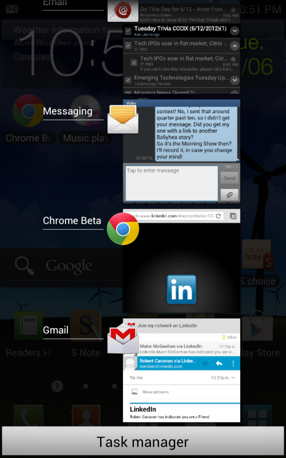
Multitasking, something of an afterthought until now, becomes integral in Android 4 (Ice Cream Sandwich). Hold the home button and every app you’ve used recently is there waiting to take up from where you left off. Well I say recently; presumably it’s limited by available memory, but it seems able to hold dozens.

That “Deck of Cards” view in Google Chrome Beta for mobile, allowing you to flick through your open tabs. This is a really good idea.

Another feature of the new Chrome browser – preview of search results. Touch a small magnifying glass icon in the results and screenshots are spread out for you. It’s remarkably fast too.


In short, I love this browser! It’s not perfect yet; it crashed once, and it took me a while to coax it into allowing me to upload those screenshots. (Tip: Zoom out. When screen is magnified, WordPress can get confused about which link you’re pressing.) But I created this post using it exclusively, a real-world challenge involving complex JavaScript-heavy pages and devilish floating input panels. The only mobile browser to even barely pass before this was Nokia’s MicroB, which is essentially desktop Firefox for Linux in a mobile guise. To finally surpass this is high praise indeed – and an indictment of other mobile browsers when you consider that they’re still behind a standard Nokia set three years ago.

Anyway, the take-home here is that mobile browsing finally works right. Well done, Google.

Categories
Technology

Galaxy Note With Ice Cream Sandwich

image

The latest version of Android is at last available for Samsung’s Galaxy Note!

Well, kind of. If you live in certain parts of Germany, and perhaps downwind. No one is sure when carriers will actually make it available in their location.

Tired of waiting I cracked, and installed Ice Cream Sandwich myself. A caveat then: As far as I know the version I am using is precisely the one that Samsung released to carriers in Ireland¹, but there may be more to be done with it before the networks roll it out. Particularly, while it appears to be the latest version of Android (4.0.3) complete with Samsung’s “TouchWiz” top layer, not all of the much-publicised Premium Suite seems to be present.

(The only obvious inclusion in fact is S Note, which seems to be a more capable replacement for the – already very useful – S Memo note-taking and sketching app.)

Anyway, that’s all beside the point. What’s it like!?! The initial impression might be a little disappointing – it hardly seems to have changed at all. But that’s because the front end is still Samsung’s TouchWiz customisation. Look closer and you begin to see quite the opposite – everything has changed. There hardly seems to be a single element of Android that hasn’t been either subtly or radically improved. This really is a new OS. It shows best perhaps in an improved tightness, in a great many more options and details, more fancy transitions. All in all, just a nicer overall experience.

For me of course, what matters most is the pen functions. And the good news is, my hopes are realised. That little dot appears on the screen to show it tracking the pen tip, so you know exactly where your line is going to appear when you draw. As odd as that might sound to those who haven’t tried it, this makes drawing far more spontaneous and intuitive. And the pen seems to have become even more responsive too. As you can see above, it gives you a natural, ink-like line. I can say unequivocally now that this must be the best pocket-sized electronic sketchpad you can acquire.

The wider public I think will be more impressed by something that doesn’t actually come with Ice Cream Sandwich, but requires it: The beta version of the new mobile Chrome browser. On a big screen like the Note’s you can set it to act like a desktop browser, and it can deal with complex, JavaScript-laden sites such as editing WordPress.  Clever pop-up magnifications help you choose small menu items, and it employs a metaphor that stretches back to PalmOS, the lost rival mobile system, and even all the way to the original WAP mobile browser – that of a “deck of cards”. Open tabs can be viewed almost as if they were a poker hand, and unwanted ones can be flicked away. It’s all very cute and fluidly animated, basically making other mobile browsers – even Apple’s – look crude and unfinished. And it’s still in beta.

This alone makes the upgrade something to look forward to. Hang on, it can’t be much longer now! And if you are thinking of buying a Samsung Galaxy Note, be assured that the bits that seemed rough on release are now smooth. The fabulous tablet-phone just got more fabulous.

As well as Vodafone, The Samsung Galaxy Note is now available in Ireland from 3 and O2.


  1. For the more technically inclined reader: The ROM I installed came from here; to flash it I used Odin, a simple process that doesn’t even require you to root.  Note that I am NOT recommending you try this yourself. It almost certainly voids your warranty, and there is a non-zero chance that it will irretrievably destroy your phone. 
Categories
Technology

The Galaxy Note In Depth – 1. Form Factor

Not how Google Earth looks on the average phone. Click to appreciate the full-size image

It isn’t yet possible to definitively review the Samsung Galaxy Note. We still await Android 4 (Ice Cream Sandwich), which has the potential to make huge differences.

Some of you have phone-buying decisions to make right now though, so I’m going to start at the finish and try to answer questions potential buyers might have. Questions like “Well, should I get this phone then?”

Yes, unequivocally. I can quit early today.

Oh all right, some more detail. Matthew already gave us a thorough run-down of the Note’s hardware and features, so I’ll try to talk more about personal impressions.

So what have you heard about the Note? That it’s big. Huge. Unwieldy even. Some reviewers said it would be difficult to use, even predicted that you would drop it all the time.

They were all wrong. There is nothing impractical about the Note’s size. It feels strange to hold at first, and you will worry you might drop it. But without wanting to tempt fate, a month has gone by sans fumble. Maybe it helps that I bought a case for it, but – though I certainly would recommend getting a case for a piece of glazing like this – I think it’s more just a matter of getting used to it.

You find yourself using it in a more two-handed way than you would a phone of less unusual dimensions – if you have tiny paws like mine at least. Since launch Samsung have actually added the option of a smaller number pad offset to the side to make it more usable with the thumb, but I dial a number so rarely these days I’m perfectly happy to do it with my other hand.

Some reviewers said people would point and laugh at you if you made calls on it in public. That was nonsense too. The public is used to big-screen phones like the Galaxy S II or Droid Razr. The Note is bigger again, sure, but not startlingly. I don’t think I’ve had even a second glance so far. Kind of disappointing really…

So there is very little downside to the the sheer vastness of the Note. The upside is out of all comparison. It’s just… so damn beautiful. (Look at the screenshot of Google Earth above. And remember, that’s been scaled down to fit in here. Click on the image to see the actual pixels.) And yet, also practical. The extra real estate makes everything work that bit better. Browsing, reading, using apps, watching video, entering text on the screen keyboard. The Galaxy Note is an ideal satnav device for example, its big screen allowing you to check out your route at a glance. Plus you can use it in portrait mode, which when you think about it is the way that satnavs really should have been designed in the first place.

Any faults? I don’t think so. Some said the colours were oversaturated, but I find them fine; perhaps Samsung tweaked that. It’s pentile instead of ‘proper’ RGB which means it has a lower effective resolution, but the pixels are so tiny you really can’t tell. It’s small for a tablet, yes. Some tablet-specific apps are going to be impractical, especially when Ice Cream Sandwich allows those written for Honeycomb to run on it. But it’s the biggest tablet you’ll ever get in your pants pocket to bring with you all day.

And yes it’s perfectly comfortable in your pants, despite every other review warning that it is “only for those with bigger pockets” or words to that effect. We learn from this that a lot of technology writers are either (a) surprisingly wary of new things or (b) tiny.

Next time, we’ll get to grips with that pen.

Categories
Technology

What Will Be In The Ice Cream Sandwich?

image
It may lack a pen cursor, but the responsive line you can create demonstrates the Galaxy Note's potential as a drawing tool

I am eating an ice cream sandwich, thinking about Ice Cream Sandwich. This is either a complete coincidence, or my subconscious is taking the piss.

I refer of course to the next version of the Android operating system. Each one is named alphabetically after a dessert, because the people at Google maybe drink a little bit too much at lunchtime. So the main current version of Android is known as Gingerbread, the one they brought out specifically for tablets is called Honeycomb.

Ice Cream Sandwich is meant to reunify the line, to combine the features of both phone and tablet versions and scale well to screens of any size. So far it’s available on few devices except the Galaxy Nexus, but it’s promised soon for Samsung’s other large-screened Galaxy phones like the fantastically popular S II – and of course the Note.

As I’ve mentioned, us Note owners in particular are champing at the bit for ICS. It seems such a desirable match for a device that also combines features of phone and tablet. And if leaks are anything to go by, it will introduce all-round improvements to performance and the interface. Not that there’s a lot wrong with the Note as it is; if there were no ICS waiting in the wings I’d probably be quite satisfied with Gingerbread. The main frustration is knowing it’s there, being dangled. The release date has slipped so much now that Samsung have promised a compensatory “Premium Suite” along with it, which includes a more developed pen-based note taking app and – wait for it – an exclusive level of Angry Birds.

Well and good, but for me there is a major disappointment.

A thing that could really improve the Note’s pen is a pointer, tracking the pen tip as it moves above the screen. The hardware allows for this; it’s precisely the same as that recommend for Windows pen input. On the Tablet PC and its descendants, the pen’s position above the screen – not on it – moves the pointer in the same way a mouse would; actually touching the screen with the pen is equivalent to a mouse click.

This is made possible by the clever Wacom technology employed. The pen has a radio circuit inside it. It isn’t powered by any battery though, but by radio itself – it simply resonates to a signal broadcast by a grid behind the screen. The same grid detects this echo, and thereby tracks the pen’s position. Pressing the pen’s button, or touching the screen with its pressure-detecting tip, simply modifies the signal returned.

This is excellent for drawing, because with an electronic pen there will almost always be some calibration issue – the potential for a difference between where the pen tip touches the screen and where the mark it makes appears – even if it is only parallax caused by the thickness of the screen glass. But if you use a pen and screen system like Tablet PC or Wacom’s Cintiq, you soon learn to watch not the tip of your pen, as you would if you were drawing on paper, but the cursor that tracks it on the screen. That way there is no calibration issue, your line appears precisely where you expect.

Samsung’s S Pen however follows the same paradigm as finger input. The screen is – seemingly – unaware of the pen’s position until it touches it. But Ice Cream Sandwich, being conceived to run on a much wider range of hardware, has native support for digital pens which includes being able to respond to “hover” events. It must therefore be aware of the pen’s exact position above the screen – and could be displaying it.

So it would be nice to see a little dot tracking the pen in S Memo, the Note’s inbuilt drawing app. But going by videos of a leaked version of the upcoming firmware, it seems alas it is not to be. Perhaps Samsung consider it too big a break with the touch-input paradigm. It’s a shame though, because the potential seems to be there.

Will we see developers taking on the challenge? A drawing program with a pointer could be a killer app for the Note range of phones and tablets. Especially if it also had the other features most sought after by artists: Layers of course, a good painting engine that creates convincing brush and pen strokes (like the one from the open source MyPaint project), and selection and fill tools.

Anyone feel like coding that?

alas

Categories
Cosmography Technology

Androids And Sunshine

image

Again an incredible day. Not hot exactly, maybe about 18C. The sort of temperatures you can wear as little as you like in, yet walk around all day without breaking a sweat. Comfortable weather. Relaxed weather. Sexy weather. I sat by the canal and contemplated my navel. Then I contemplated my friend’s navel. Hers was best.

But back to Android. I’ve had more than a week to get used to the world’s leading smartphone OS. How am I feeling?

Still a little irritated, to be honest. But that’s not really Android’s fault. I’m asking a lot of it – in essence, I want this phone in my pocket to do almost everything I carry a PC around for now. The major exception would be complex Photoshop work for finished drawings, that really would be overambitious, but I hope to be able to do most of my spontaneous sketching, as well as all the online stuff of course. And some serious text editing, such as this.

As I was saying earlier, I was spoiled for mobile blogging with the Nokia N900. By its excellent desktop-like browser, but also its hardware keyboard. I am getting to like using Swype though, the text entry method where you trace from letter to letter on the keyboard. It is very good, but there are one or two things Android really, really misses badly.

Like Ctrl+z.

To my shock and astonishment, there its no universal command in Android for “undo”. And undo is something I use a lot. A lot lot. On every keyboard I’ve owned, the Z is always first to wear off. So its absence is deeply disorientating. And painful. I was writing this column yesterday, and accidentally hit the “select all” option. How to undo that? I try the Android “back” key, as conceptually back is a little like undo.

Only – and this is a mistake I’ve made many times in my first week – instead of hitting the back button in the bottom right corner, I hit the return key on the keyboard, immediately above it. Which overwrites everything with a new blank line.

So I… Wait, I… There isn’t anything I can do. Two wrong key presses, and I’ve consigned an hour’s work to oblivion. Crap.

That ain’t good enough, Android. As there is no undo feature in the OS, entering text into a Web page becomes extremely hazardous. (A browser has no undo feature, as it assumes one exists in the OS…) Of course an individual app can have the facility, but guess what? The WordPress one doesn’t.

So until Google fix this shit I need a new approach. I found two. The first was a custom keyboard that also has undo functions. That means doing without Swype unfortunately, but it may be the solution for some special purposes. Or if you don’t happen to like Swype anyway. The one I’ve tried is called Programmer Keyboard, a lovably OTT solution that gives you a full 101-key desktop board on your phone!

And it also gives me the other thing I really miss from Android – arrow keys. Oh but you can select things with your finger! Yeah, or the letter next to the one you want, and then the one the other side of it, and then the line below… Gimme arrow keys.

A better approach though is to avoid composing the text in the page or app altogether, by using a proper text editor. The one I’m trying – and liking – is called Jota. (Pronounced “iota” rather than “jotter” apparently; I have no idea where the developer is from.) This has all the essential editing tools, for both writers and coders, even in its free version – and that includes multi-level undo.

Oh, and you can put arrow keys on its toolbar too. People, we have a winner.

%d bloggers like this: