Categories
Cosmography

Writing On An All-Screen Phone

What’s the best way to enter text on an all-screen phone? Some would say there is no good way, that nothing remotely compares to physical keys and screens are no good for anything much longer than a Tweet. I don’t agree, but it has to be admitted that on-screen keyboards like the default ones on iPhone and Android are no pleasure to use. Simply put, you’re never going to touch-type on keys you can’t feel, and the addition of “haptic feedback” – the fancy name for a buzzer that goes off when a key is pressed – does little to help. The old T9 predictive texting was faster.

Prediction can be used here too of course; a system like autocorrect on the iPhone helps – just not much. (And it can go famously wrong.) It’s very much a band-aid for a flawed approach. Far faster, because they play to a screen’s strengths, are systems that work by drawing a line through letters instead of tapping each one, like Swype.

So effective is it unfortunately that Swype has some exclusive deals with phone makers, meaning it comes pre-installed on certain better Androids but is unobtainable for the rest (though you can get a beta version). It’s not yet available for iPhone either, though curiously it is for Symbian.

But why write with one finger? Typing with both thumbs is much quicker, especially if you have a big screen. And there are some nice keyboards designed especially for it, split in the middle to be more literally under your thumb. Again though the lack of feel slows things down. Logically a good combination should be a thumboard and prediction – Swiftkey is probably the most famous example – but I’ve yet to find one that I really enjoy using.

So what about handwriting recognition? Writing with a pen is never as fast as typing of course, but that’s comparing it to real keys. The great thing about a pen (or stylus) for a screen is that it doesn’t require tactile feedback. So it’s a perfect fit? In theory, I think so.

In practise, not always. Decent recognition of cursive handwriting was only achieved on desktop computers a few years ago, so it’s a lot to expect from a phone. Users of Samsung Galaxy phones will probably have tried the inbuilt handwriting recognition – and given up again sharply. It’s tedious to use, thanks to low accuracy and an overcomplicated interface. There are other apps in the marketplace of course, but some of them are pretty expensive.

And then there’s 7notes with Mazec. Let’s face it, the name could’ve been more informative. A lot of people will overlook this because it’s presented as a note-taking app, and there are countless note-taking apps on Google Play and iTunes. 7notes doesn’t even seem a particularly good one – though it has the unusual ability to store handwritten notes and convert them to type later. Its ‘secret’ however is the Mazec text entry system. This installs like a keyboard and so can be used to write with any app, not just 7notes. Only it takes pen strokes instead of key presses.

Perfect it’s not – could handwriting recognition ever be? – but it can convert scrawl to type with impressive speed and accuracy, comparing well to the pen input in Windows. Obviously it’s ideal for use with a stylus, (and to any other owners of the Galaxy Note out there I say simply: Get this now), but it works very well with a finger.

And it’s cheap. Despite its Japanese-language sibling costing an astonishing (for an app) €9.70, the English version is only 99c for Android and Kindle Fire, and free for the iPhone and iPad. Best cost-to-usage ratio I’ve ever found in an app. It’s my default ‘keyboard’ now.

I just wrote this with it.

Categories
Technology

Beneath The Surface

Microsoft’s Surface initiative is, when you think about it, a sort of conjuring trick. I’d call it sleight of hand but that seems unduly negative. It is an attempt to make something vanish though: a distinction.

What’s on the table before the trick begins? Two tablet computers that could hardly be more different. They are examples of today’s two major “architectures”, rival ideas of how computers should work. One, as we saw before, has an ARM processor and is hardly distinguishable internally from an iPad or an Android tablet. The other has an Intel processor and is in all meaningful respects just an unusually-shaped PC.

Yet the wand is waved and voilà – these two entirely different things are both “Surface”.

Hence the name, perhaps. The two devices are remarkably similar – on the surface. They have the same touch-friendly interface and can run the same “Metro” apps. The major difference is that the Intel one will be able to run conventional Windows software too. Which will, let’s face it, be pretty confusing to the consumer. At some point Microsoft will have to clarify this distinction between the devices. But right now they want to emphasise the similarities, present them as a unified concept. Why?

The most crucial reason is to offer a response to Bring Your Own Device (BYOD), the recent trend for allowing people to use their own computers in work. It’s very attractive to cash-strapped companies – why pay for hardware when workers might actually prefer to use their own? The savings may prove illusory though. Getting enterprise-wide computer networks to run well can be hard even when everyone’s using the same operating system on identical hardware. When you have a mix of Windows and iPad and Mac and Android and BlackBerry… It could make the lives of IT staff living hell. People will be carrying off classified documents on the same tablet that their kids play with, a device that doesn’t even ask for a password.¹ Fad or not though, BYOD poses a direct threat to Microsoft’s core market – because the Ds the people generally B are iPads.

So they’ve responded by offering a product that will – they hope – be as simple and likeable to use as an iPad, but can run enterprise software and be managed and secured by systems their clients already have. It might not be the same tablet that the kids use (though it might be too), but it could share the same apps, the same games, the same interface and even the same accessories as that cheaper device.

That is a creative response to the challenge. Will it work? It’s hard to say. A lot has to be right for this to come together. Being competitive with Android tablets will not be enough. The ARM version of Surface has to compare well to the iPad. That’s the reason Microsoft are making their own – to have the same advantages that Apple enjoys; the synergy of software and hardware developed in tandem, the single dominant design to attract an aftermarket of accessories and thus consumer buy-in. Other manufacturers can make Windows tablets that compete with Android; Microsoft will compete with Apple themselves.

I think they might be able to pull that one off. The greater challenge is actually the Intel version. The iPad works because its ARM chip demands far less power than an Intel one, so you can use it for a real working day without worrying about charge. Will an Intel device be frustratingly short on stamina, or have such a huge battery it will dislocate your arm? The danger is that it will fall between two stools, be a poor substitute for a laptop and for a tablet.

But if they can pull it off with some technical trick – if, for example, Surface can drastically reduce its power demands when only running “Metro” apps – then it could be a remarkable product.

  1. One security plus though – research has shown that when people bring their own devices, they’re a lot less likely to leave them in a taxi.
Categories
Technology

Microsoft Makes Its Move

Today, the final piece of Microsoft’s strategy slotted into place. They announced Windows Phone 8, their new OS for phones. It’ll still have that pretty tiled “Metro” interface, but to the consternation of those few people currently developing apps for Windows Phone 7, just about everything else is changed utterly. We’ll see why later.

And that’s not even the most unexpected part of the new strategy. Yesterday they tore up the playbook and actually made a thing. Of course the software giant has done hardware before, almost from the start indeed. They produced their own mice to make sure the peripheral vital to Windows would be standardised and cheap. There was the highly successful Xbox, and the highly unsuccessful Zune. But this is the first time Microsoft has made their own… Laptop? Tablet?

A little from column A and a little from column B. Microsoft have decided, reasonably I think, that somewhere between the tablet and the ultra-light notebook there’s a product waiting to happen. And they call it Surface.

Which is a little confusing, because up till now Microsoft Surface was an intelligent multi-user tabletop wholly unrelated to this device (and now renamed PixelSense). Maybe they envisage integrating the two technologies at some future date, but really it seems they decided Surface was too cool a name for anything except their coolest product. The nerds.

Even more confusingly, Surface comes in two versions. Both are slim 10.6″ tablets. Both have a light and attractive magnesium alloy chassis. Both have a neat kickstand that props it at a good viewing angle. Both can use intelligent covers that attach with magnets. Shades of the iPad’s Smart Cover perhaps, but these are also keyboards, instantly transforming tablet into laptop. They come in a thin touch version and a slightly thicker one with some key travel, and both can be used with either Surface model.

So how then do they differ? In a word, fundamentally. The slightly more svelte of the two uses a RISC processor from ARM, like just about every tablet or smartphone on the market, and runs only “Metro” apps. It does have a desktop, but only as an environment for editing multiple documents with a built-in, touch-friendly version of Office. No conventional desktop software runs on this, so it is very much to the PC as the iPad is to the Mac. And much as the the iPad has a special, much-reduced version of OS X called iOS, so the Surface has Windows RT, a stripped-down variant so named because it only runs apps written for WinRT.

That should make the confusion complete… I’ll go over this again because it’s going to come up a lot in the next few years and you won’t regret getting it straight now: Windows RT, Microsoft’s operating system for ARM processors, is called that because it only runs WinRT.

So what the hell is WinRT? It’s the new Windows “runtime”, a programming environment providing simplified access to the hardware’s resources – memory, camera, sensors, network and so on. Apps are created to run in this environment.

OK, what about the other model, sometimes referred to as Surface Pro? It looks very similar to the basic version. The only different dimension is thickness – the Pro has an extra 4.2mm to accommodate (among other things) an Intel Core i5 processor, just like you’d find on a good laptop or desktop PC. So it has a perfectly normal version of Windows 8 for its operating system and can run all traditional Windows programs. In many ways this incarnation of Surface is simply a reboot of the slate-style Tablet PC, such as those made by Motion.

Except of course that it also has WinRT, and so can run just the same apps as the ARM version in just the same Metro touch interface. This then is the key idea: WinRT works on both the Intel hardware architecture and on ARM. The same apps will run on tablets, laptops and desktops, no matter who makes the chips.

So have you guessed? Yes, Windows Phone 8 also has WinRT. That’s why they had to rebuild it from the ground up. Before, the phone and desktop versions of Windows had been pretty much completely incompatible. From this on they will share a lot in common. The very same apps – with suitable adjustment for screen size, etc. – will run on phones as well now.

But wait, there’s more!

Another of Microsoft’s recent flurry of announcements was SmartGlass, which helps integrate tablets and phones with the Xbox and so with your TV. The possibilities are intriguing, especially if – as I think is a completely safe prediction – WinRT comes to the Xbox as well. No one else can offer a single platform for developers like that – phones, tablets, laptops, desktops and perhaps game consoles, all running the same apps. For the first time in years, Microsoft look like a company with a vision.

Categories
Technology

Shopping For Toys In Hell

It's the phone you write on

Bleurgh.

But first the good news: The Samsung Galaxy Note is finally available in Ireland, from Vodafone.

The mixed news: It’s pricey – ranging from €100 up front on a 24-month “I wish to buy all these airwaves” heavy use contract, to €300 if you only want to be committed for 18 months. That puts it on a level with only the iPhone 4S.

The medium news: Maths is hard. Or to be precise, arithmetic is tedious. But having hammered through nine different contract options, amortising the down payment to try and figure out which is really the best value, there is one inescapable conclusion. They’re all nearly the bloody same. The most expensive one has five times the minutes, ten times the texts and twice the data as the cheapest – but only costs a third more a month.

But will I need all those extra minutes, or can I save that third off the price? Well that really depends on how much I use now. And my current carrier O2 doesn’t put all that information in one place, so I have to go extracting it from each month’s bill… And of course it’s not presented in terms of what you actually used. Oh no, that would be far too simple. Unless that is you want to get it from the downloadable Excel spreadsheet – where they put your spend on voice, text and data all in a single column, so rendering it it ****ing useless.

What appears on the bill is how much you were charged for exceeding your allowance in that month. To work out what that means in terms of usage you have to divide it by the price, and nowhere on the site does it seem to say anymore what the tariffs for excess minutes, texts and data are for my contract. So I have to figure the pricing out from the spreadsheet – factoring in the VAT of course. And this still tells me nothing about the months when I was under my allowance; that I have to extrapolate from the bell curve (i.e., guess). Gaaaaah. My brain hurts. Shopping for toys ought to be more fun than this.

They do it to make their customers stay. We know that we might get a better deal somewhere else. We just can’t tell where.


Categories
Technology

The Obligatory iPad 3 Post

Apple have launched another iPad. Hooray.

Oh all right, I suppose it does merit a little more analysis than that. Rather like the iPhone 4S it’s another no-surprises upgrade. Solid – and in the case of the screen, substantial – improvements, but no hoverboots. Or maybe in Steve’s day we would have been convinced that the synergy of 4G connection speeds, high resolution screen and image-stabilizing camera creates an entirely new product with previously-unimagined purposes. Now it seems more for the stockholders than some mysterious cause.

What didn’t we get? A smaller iPad. An iPad with a pen input tool. An iPad with an iPhone in it. An iPad with an iPhone in it and a pen input tool that is also a Bluetooth phone receiver. Stuff like that. (I have to admit, in maybe a decade of designing tablets and phones in my head, nothing as out there as a pen you can make phone calls on ever occurred to me.) OK, gimmicky perhaps, but fun. Apple boringly stick to making a really good product that sells by the freighter-load.

Only one annoying element really. They’re not calling it the iPad 3 or the iPad 4G. They insist it will just be called “the iPad”, as if we’re expected to forget the existence of any previous, lesser iPads. A little Orwellian for my liking.

Categories
Humour Technology

Truth – There’s An App For That

Back in the day – which, to clear this up once and for all, ran from 1997 until 2003 – I was a big fan of The Brunching Shuttlecocks, perhaps the first really successful Web-based comedy team. Sure there were funny sites before, but they tended to be collections of jokes that could have – and often had – been published in other forms. There were Web incarnations of humour that already existed in other media, such as The Onion. There were webcomics, but again they could have appeared anywhere – if anywhere much still published comics. The Brunching Shuttlecocks though did humour that was, to a large extent, native to the Web.

Which didn’t just mean it was geek humour – though yeah, a lot of it was. More importantly though, much of it was among the first comedy that simply could not have appeared in any other medium. Items like The Bjork Song or Tina The Troubled Teen took advantage of technologies like scripting and object embedding to do jokes in new ways.

The Brunching Shuttlecocks are with us no more alas. The website isn’t even available now due to a hosting dispute, (though word is it will return soon). Main contributors Lore Fitzgerald Sjöberg and Dave Neilsen have long moved on to other things. Despite its eight-year lack of existence though, there’s still a surprisingly active fan community.

And now, you can Brunch (as we say) on your favourite portable Apple product. One of the best-loved items on the site was Good Or Bad?, an interactive feature where readers could vote on whether a random range of bizarre things were, well, good or bad. Votes were collated, and their fundamental value discovered. The free app actually expands on the original idea because it allows you to add your own items for the crowd-sourced assessment of other users, though it comes with the original (and hilarious) Good or Bad? content as ‘seed truth’.

Ever wanted to know whether that feeling you get in your stomach when a lift goes down, or the weirdly satisfying sensation of accidentally treading on a snail, or the big button at the pedestrian crossing that doesn’t apparently do anything is a good thing or bad? Now you can, definitively.

Categories
Humour Technology

The Guardian Monster

London Underground roundel logo
Quis Custodiet Ipsos Custodes?

Oh the Guardian, that normally well-regarded major UK newspaper, has had a ****ing brilliant idea. You see, if you read a story in the online version of the paper, you can share it on Facebook using their app.

Actually if you are logged into Facebook – even in another browser window you’ve forgotten is still open – it automatically posts the article you’re reading. It does say when you install it that the app will share what you read, but I don’t think the casual user will immediately realise this means “without even asking”. I certainly bloody didn’t.

So at long last, the Guardian has managed to fully automate the process of having someone reading over your shoulder. In this way online readers all over the world can partake of the authentic crowded London tube experience.

But that’s not even the worst part. The link it posts doesn’t actually go to the article, it – yes – offers to install the app. So you accept because you want to read the story. All your friends will then see what you’ve read and install the app so they can read it, which will tell all their friends what they’ve read… This thing is going to spread exactly like a virus.

Indeed the figures seem to be bearing that out. Two weeks ago, after being out only a month, they had their millionth install. At that rate we have about one week left to enjoy Facebook before it collapses under the sheer weight of Guardian links.

Categories
Technology

How To Play With Windows 8

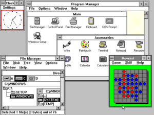
Windows 3.0, released in 1990
Lovely, isn't it? Wait, wrong picture

So, you want to have a go on Windows 8? It’s easy enough, but there are a few things you must bear in mind first:

  • Only do this if you have a spare computer to try it on, or are familiar with setting up a dual-boot system. If you install it as an upgrade on your working computer there will be no way back afterwards short of completely re-installing your old version of Windows. And all your software. Assuming you can even find all those discs. And remember all those hundreds of settings. Basically it’s a world of pain and you don’t want to go there.
  • You’ll need at least a 1GHz processor, 1GB RAM, 16GB of free hard drive space (20GB for the 64-bit version), and a DVD burner.
  • You indemnify me for anything that can, and probably will, go wrong. Windows 8 is Not Ready For Prime Time, and the management is not responsible for lost data or computers exploding in sprays of white-hot metal.

OK, You Ready? 

(If you’re starting with an empty hard disk, or one you are OK about permanently obliterating, you can skip the first two steps. Otherwise, skip nothin‘.)

  1. First, back up any important data on the hard drive you’re partitioning. (If you don’t know what partitioning a drive is you are in too deep and should back out now…) If it also has your working Windows installation it would be a very good idea to image the whole drive, then if everything goes horribly wrong you have a good chance of easy recovery. (Macrium Reflect is a free yet reliable way to image drives.)
  2. In your spare drive space, make as large a partition as you can afford – it must be 16GB at least. It should be a primary as opposed to a logical or extended partition.
  3. Next, download the Windows 8 Developer Preview, choosing the right version for your hardware. (If you aren’t sure which is the right version then, again, you shouldn’t be trying this.)
  4. Once downloaded, burn it to a DVD. (If you try to mount and run the ISO image it will only offer you the option to install to your C drive, which you don’t want.) Label the DVD “Deadly Space Virus”. Or, you know, whatever you like.
  5. Boot from the DVD. (Just possibly, you may need to change your BIOS settings to allow that.) You’ll be offered a nicer-looking version of the usual Windows install dialogue. Go through it, selecting your options with great care.
  6. Take PARTICULAR care when you are asked which partition to install Windows 8 to. Make sure it’s the one you just created. One error here, and you return Earth to the stone age. Well all right, you destroy your existing Windows install and/or all your data. Which is bad enough.
  7. Once you pass this point, things go remarkably fast for a Windows installation. When it’s finished, you’ll be greeted with Windows 8. It’s quite pretty. You’re not finished.
  8. Get online. You may have a problem with this if the Developer Preview doesn’t happen to contain all the right drivers for your hardware, but you will probably find that an Ethernet connection to a router will work. Or if you have a 3G dongle there should be no problem. Once online, get all the Windows 8 updates. (Users of some earlier Windows versions may have trouble finding Windows Update, it’s: Control Panel/All Control Panel Items/Windows Update. These downloads will make Windows 8 look and act a lot more polished.
  9. Simple! Oh wait, one other thing…
  10. If your other operating system is XP, you’re going to discover that you can’t boot back into it now. Bummer. This is because Windows 8 introduces a new bootloader that’s not compatible. To get around this, set XP as the default operating system. Go to: Control Panel/All Control Panel Items/System, click “Advanced System Settings” and then “Start Up And Recovery Settings”. Here you can change the default to “Earlier Version of Windows”, after which you’ll be faced with an option screen when you boot. Phew.

So, could this be the answer to iPad and Android? Have at it.

Categories
Technology

Windows 8 – First Impression

I.Doubt.It - installing untried, unstable software so that you don't have to. Not that you ever had to.

It’s like being a year into the future – probably more, the way these things tend to go. I’m writing this on a computer running Windows 8, the OS that is meant to get Microsoft back to the forefront of personal computing. On Windows 8, the complex and resource-hungry operating system of the past will be pushed into the back seat. The front end of your PC is going to be more like a… well, more like an iPad. More like a phone, or other lightweight browsing device. The main “Metro” interface is attractively tiled with little apps to do the little things you probably spend the larger part of your time doing. A basic browser, games, Twitter client, news feed reader, Facebook app, that sort of thing.

I have to preface my remarks with a caveat: It is not a fair test by any means. This is what Microsoft calls a Developer Preview, and it’s being released now, long before its ready even for beta testing, to give programmers a better idea of the forthcoming look and feel. Nonetheless I can start with unreservedly good news. This really does seem to be the lightest that Windows has been for some time. The spec of this computer is dated (1.2 GHz single core processor and 1.5 GB of memory), merely adequate for XP, yet XP’s great-granddaughter seems to run as well if not better. In the past I’ve used this or fairly similar hardware to test the betas of both Vista and Windows 7, but this pre-beta is more immediately impressive than either.

There aren’t a lot of other obvious changes from 7; perhaps the most notable is that the “ribbon” from Office is now in Windows Explorer. Version 10 of IE on the other hand is refreshingly clean and simple – and frighteningly fast. But of course we’re mainly here to get to grips with that weird new interface. Microsoft says it requires a multi-touch screen, but I’ve been getting by with pen input or just a mouse – Metro provides a scrollbar when needed. Presumably there are multi-touch gestures I’m missing out on. Indeed my first impression was that some such two-fingered salute must be a vital part of the interface, because for the life of me I could find no way to get those cool little apps to shut once I’d opened them.

That was when l discovered perhaps the strangest aspect of the future Windows: These apps are not meant to close. They stay suspended in the background, ready to spring back to life from wherever you left off. Which means of course that they use memory while they’re suspended, and I wonder how much they will be allowed to squander before something is done about it. Presumably the oldest will eventually be shoved onto the hard disk. If you’re desperate for memory right now you can kill them from a new-look Task Manager, but that seems a bit ad hoc.

To use the new “Metro” interface, you need to discover a couple of gesture controls that might not be immediately obvious: A stroke from either the top or bottom (with the mouse, a right-click) brings up a sort of context menu / taskbar in any app. A stroke inwards from the left edge (or touching the edge with the mouse) swaps between the two most recently-used apps – one of which can be the desktop – and most important of all, a stroke from the right (or bringing the mouse to the bottom left corner) opens the replacement for the old Start Menu. This though could hardly be more different. It holds just five icons, the main one returning you to the tiled Metro interface – which of course is the real replacement for much of the Start Menu’s functionality. Here you will find shortcuts to “traditional” application programs as well as the new apps.

Weirdly though, I found the lightweight Metro interface a little sluggish and unresponsive compared to Windows 8 proper. Pen input, smooth as silk otherwise (I’m writing this using the handwriting recognition and it works astonishingly well) is jerky in apps. Perhaps it makes too much demand on my Centrino-era graphics hardware. But if it’s still a little rough, it’s also surprisingly usable and interestingly different. Tomorrow, if you’re good, I’ll tell you how to start using Windows 8 yourself.

Categories
Technology

New Windows 2 – The Ecosystem

windows 8 preview
A Glimpse Of The Future

Perhaps as early as next year you will be able to run Windows on the same sort of low-energy ARM processors that iPads and phones use. Interesting.

What exactly is the point though? By itself, Windows for ARM doesn’t change a lot. All the programs that we use on Windows were written for Intel chips. They won’t run on ARM. They would have to be “ported” to the different architecture, and there’s no guarantee that a heavyweight program converted for a nimble processor would be anything you’d really want to use. Apple didn’t get where it is by simply porting Mac programs to the iPad. Garage Band, to take one example, is pretty much a wholly new version written to take full advantage of the touch interface.

It will be up to the market to create the software that really suits ARM-based Windows, and that of course depends on the platform taking off, which depends on the market… The Catch-22 of new technologies. Microsoft can seed it for success, but a huge amount of the detail still remains to be seen. It will surely run many Windows Phone 7 apps, but will it be able to take on the full-fat version of Office? (Rumours that it already can are probably based on an Intel tablet demo.) What about all the software created in Microsoft’s .NET framework? In Java?

Will it even have a desktop? This may seem an odd idea – Windows without a desktop? But in Windows 8, the desktop has been demoted to the status of an app; just another program, rather than an integral part of the operating system. Instead, the default interface of all Windows versions will be Metro, the “live tile”, highly touch-orientated look pioneered on Windows Phone 7. It’s all about fast and attractive access to information feeds. To do traditional work, with one or more heavy-duty application program running at once, you first open out a desktop. So it’s at least a possibility that the ARM-based version of Windows will only run lighter apps purposely designed for the touch interface. I am sure that “heavier” Intel versions of Windows will run those too though; Microsoft wants touch to be ubiquitous.

At the moment, leaving aside special-purpose and older versions, there are basically two Microsoft operating systems: Windows 7 and Windows Phone 7, and in most respects they’re distinct, incompatible things. In the near future though there could be a pretty continuous spectrum of Windows 8, over not two but four distinct types of device:

  1. Phones that can run lightweight touch-based apps.
  2. Light ARM-based tablets that can run the same apps – and some traditional software?
  3. Full Tablet PCs that definitely can run traditional software as well, but are still totally touch-orientated.
  4. Laptops and desktops that have an optional touch interface.

Hopefully they should all blend well so that data (and perhaps apps) move from one device to another seamlessly, even by touching them together. One can turn to the device suitable for your situation – a phone for walking, a desktop for work, a slate for sitting back – and find little changed about the user experience other than the size of the screen. It’s easy to see that merging very gracefully with “Surface“-type touch- and object-aware furniture. It’s as interesting as Windows has sounded for a very long time. Perhaps ever.

%d bloggers like this: